Knollwood
An internship project to redesign the information architecture and user interface of a retirement community's resident portal — for a user group with low technical comfort, real accessibility needs, and a strong preference for how information should be organized.
~70
Active users out of ~300 residents - the adoption gap that prompted the project
65%
Increase in usability post-redesign
18
Research participants: 8 usability study + 10 usability test
44
Page documentation guide handed off to sustain the site after internship
My role
Led end-to-end UX research, redesigned the IA and UI, and implemented the final build
Tools
Sketch · Card Sorting · Ning CMS
Duration
4 months
Team
UX Design Intern (me) · 5 residents who performed web administrative functions
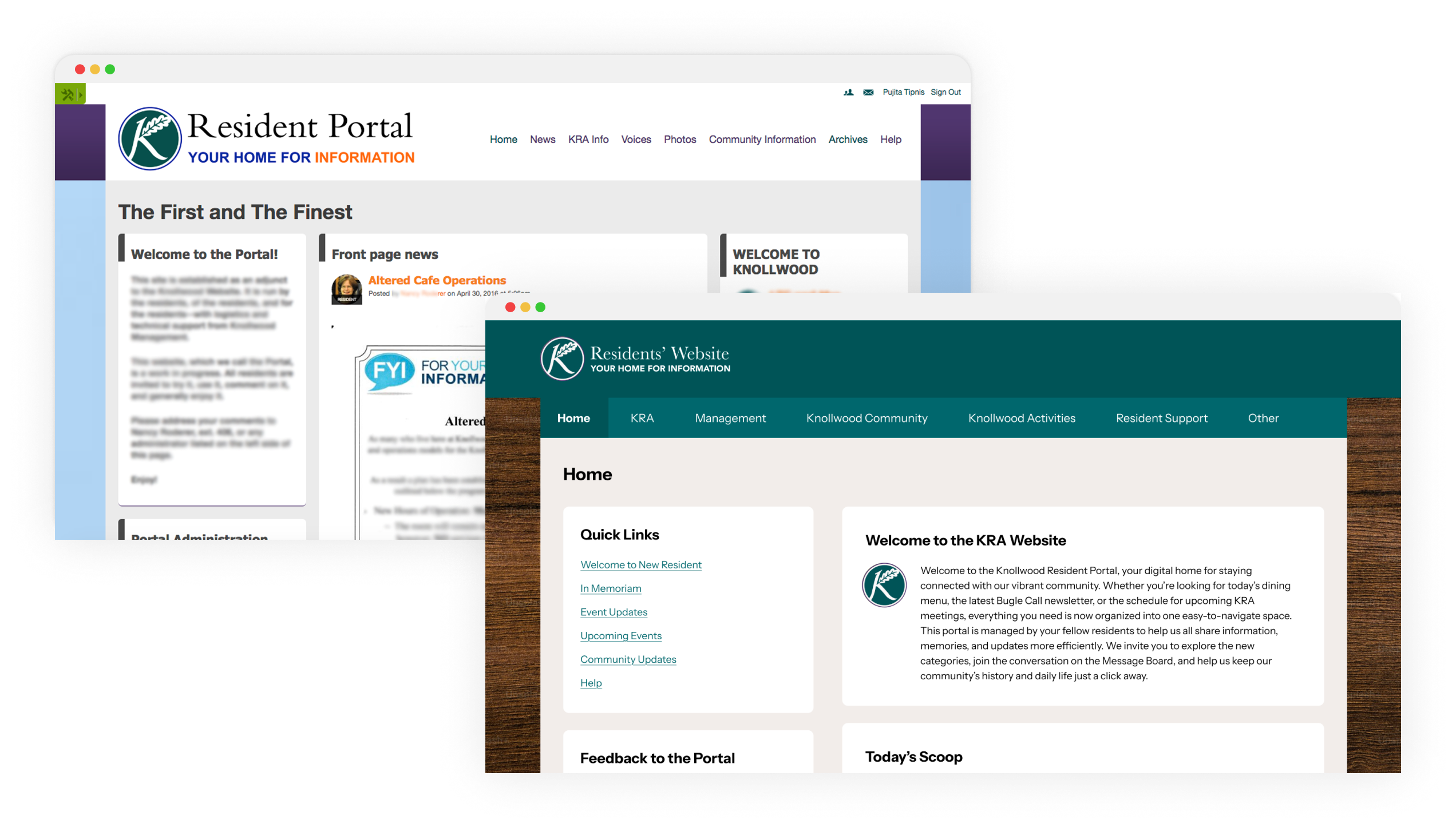
The Knollwood Military Retirement Community relied on a resident portal, built on the Ning CMS platform, to give residents access to essential information like dining menus, activity schedules, meeting minutes, community announcements, and the resident directory. But the portal had significant usability problems, and the people who most needed to use it were those least equipped to work around them.
The user group
Retired veterans, many with limited technical comfort and a long-standing preference for hard-copy information like bulletin boards. Of approximately 300 residents, only around 70 were active portal users - a gap that reflected the mismatch between the portal's complexity and its users' needs.
A second constraint
The portal wasn't maintained by an IT team. It was managed by a small committee of 3-4 residents themselves, most of whom also lacked technical expertise. Any redesign had to work for end users and remain maintainable by the people running it.
How might we improve the usability of the resident portal so that it is intuitive and displays the right information in the right place, thereby increasing utilization and boosting resident confidence in the portal?
The project ran through six phases, starting with expert review before any resident contact, moving through two rounds of research, then into design, validation, and finally a full implementation within the Ning CMS.
Expert Review
Heuristic evaluation · scenario-based evaluation · persona-informed task analysis
Usability Study
8 resident participants · 4 task-based scenarios each · observational research
Card Sorting
Open card sort with residents · IA restructuring based on resident mental models
Prototyping & Iteration
Wireframes → hi-fi · admin team review · accessibility-first design · CMS feasibility checks
Usability Testing
10 participants · 4 tasks each · validation and refinement before implementation
Implementation & Docs
Live CMS build · CSS/HTML overrides · 44-page handoff guide
Phase 01
Before talking to any residents, I started with a structured expert review of the existing portal. Using a combination of heuristic evaluation and scenario-based evaluation, I built user personas based on what I knew about the resident demographic, identified the key tasks they performed regularly, and walked through each task using Jakob Nielsen's 10 Usability Heuristics to surface issues, assess their severity, and identify potential fixes.
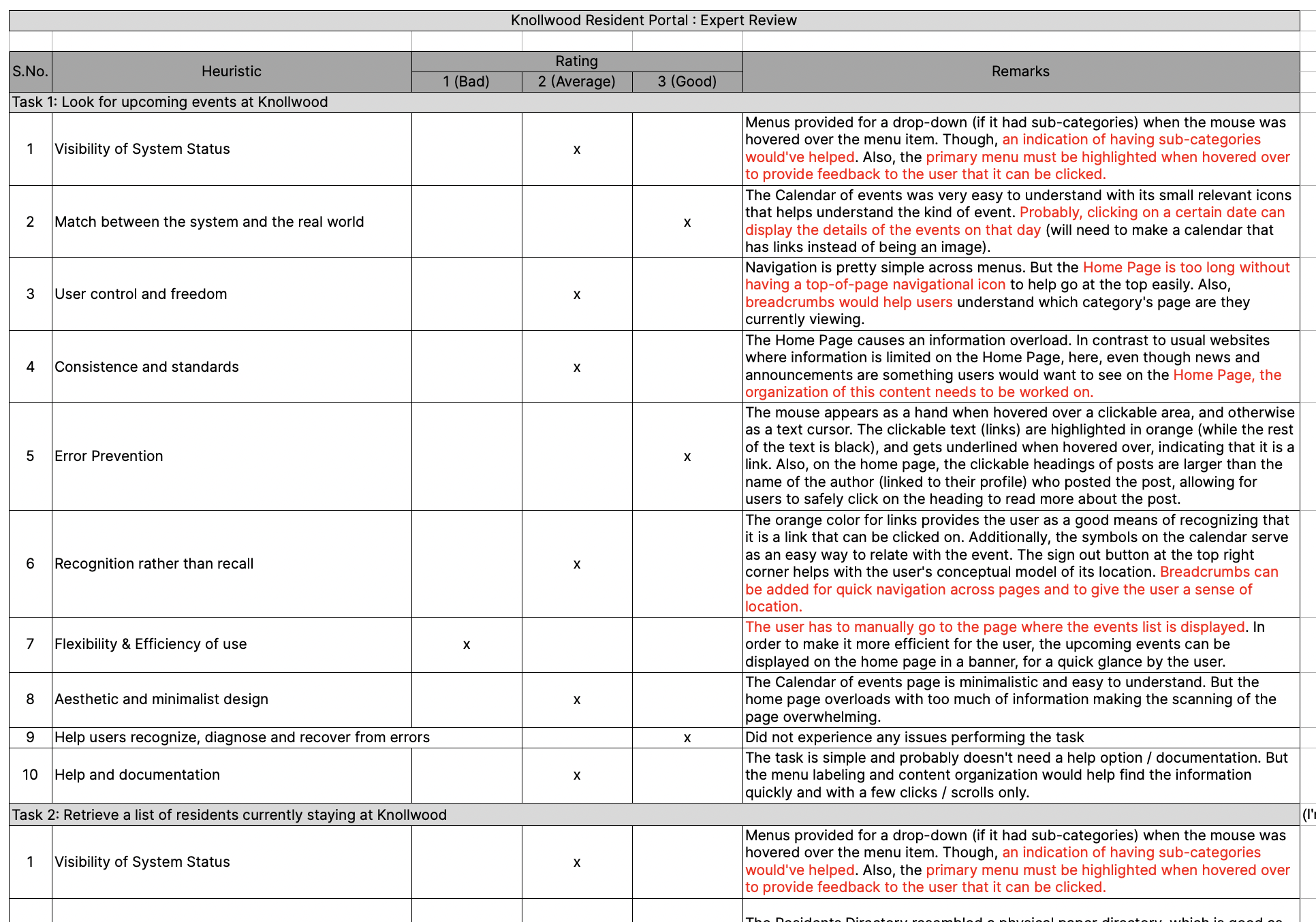
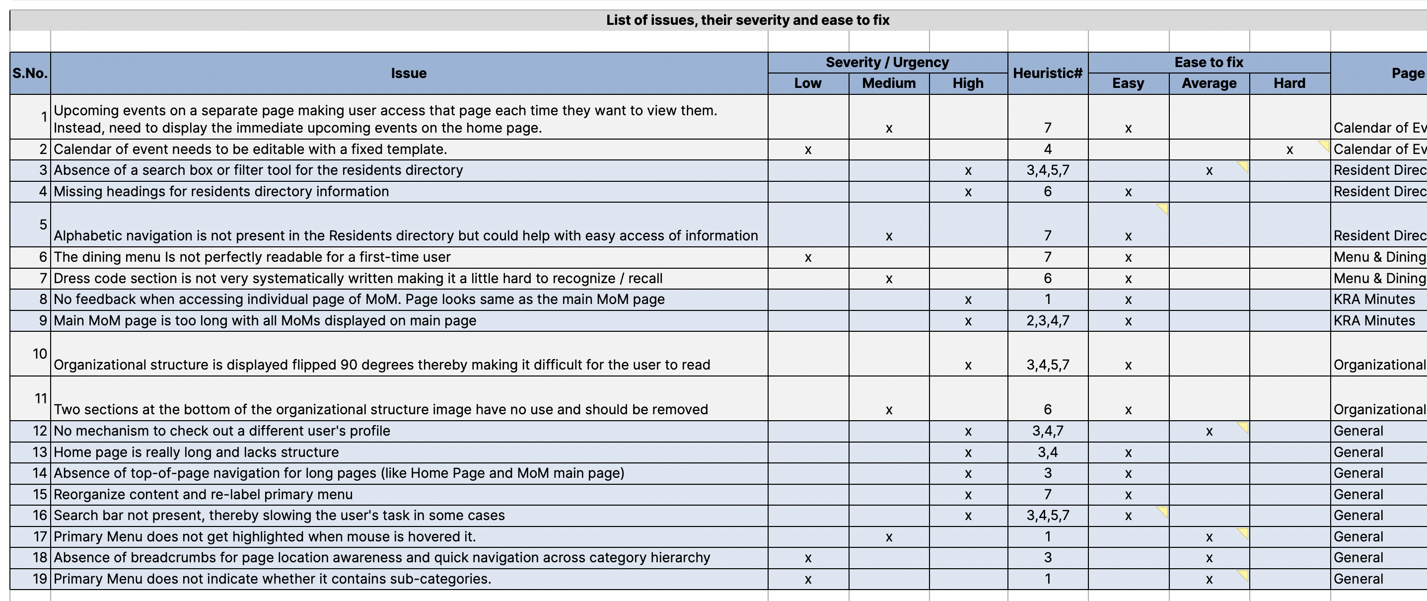
The expert review surfaced four significant issues:
Scroll fatigue on content-heavy pages
The Home page became very long on active days with no mechanism to return to the top. This was a real barrier for residents with limited mobility or fatigue.
Flat, non-interactive resident directory
The directory was a single long list with no search or filter. Finding a specific resident required scrolling through the entire list.
Ambiguous navigation interactions
Primary menu items triggered a dropdown on hover and were themselves clickable with no visual distinction between the two behaviors, causing confusion and accidental navigation.
Overly long menu lists
Some primary navigation items had so many sub-items that residents struggled to reach the bottom of the list, particularly those using a mouse for the first time or with reduced dexterity.
Phase 02
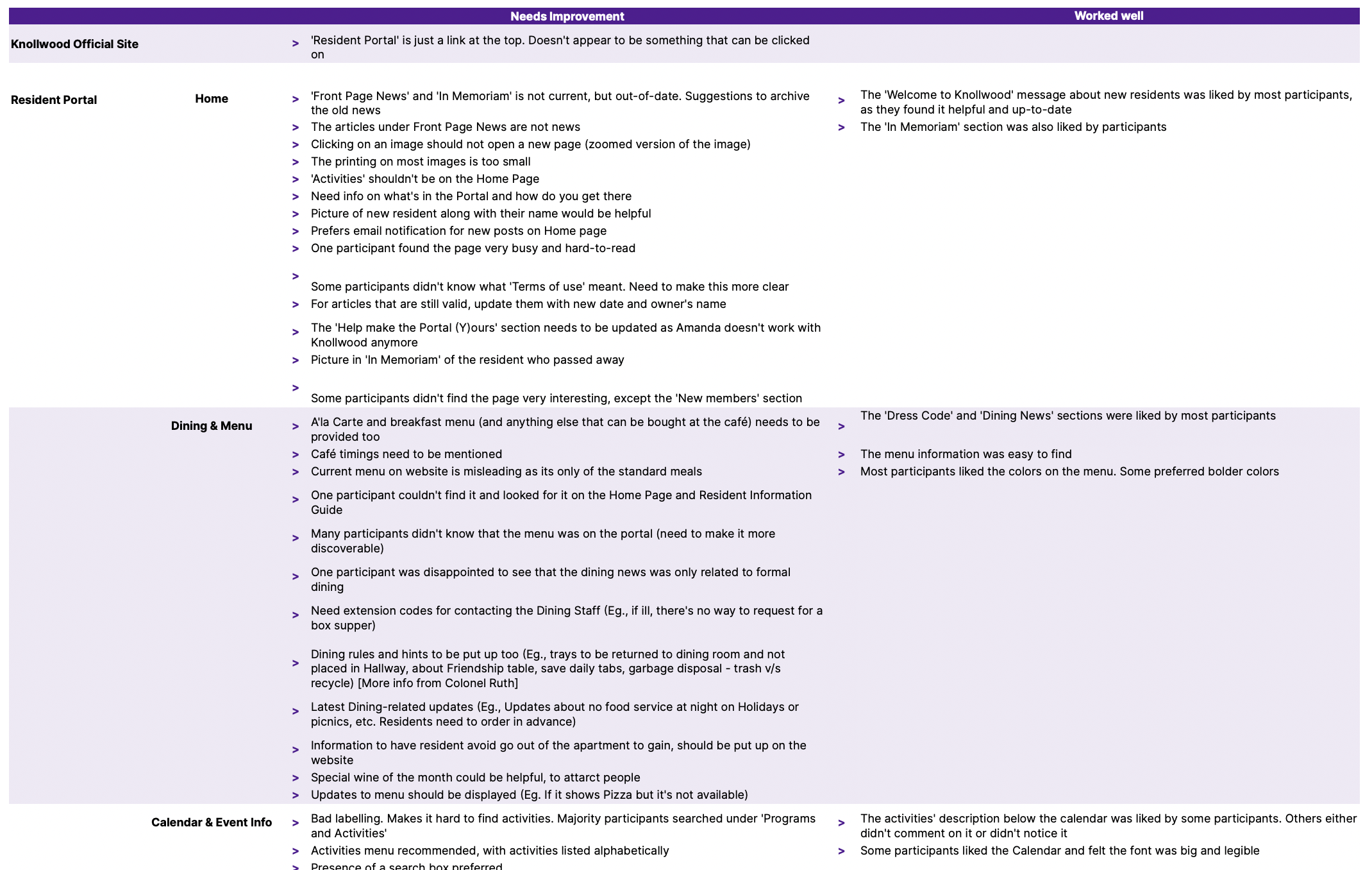
With the expert review complete, I moved to research with actual residents. I conducted a usability study with 8 residents as participants, giving each person 4 task-based scenarios to complete on the live portal. I observed where they struggled, noted any feedback or suggestions they offered, and looked for patterns across sessions.
Phase 03
To understand how residents actually categorized information, I facilitated an open card sorting activity. I gave residents 20+ pieces of content and asked them to group the items into categories they defined themselves, without any prompting from me.

Phase 04
With the new IA defined, I translated it into wireframe prototypes and presented them to the resident admin team for review. Based on their feedback, I refined the sitemap and converted the heuristic fixes and high-priority resident suggestions into high-fidelity prototypes in Sketch.
Given the demographic, accessibility wasn't a secondary consideration but was the primary design lens:
High contrast ratios
Maintained throughout to support residents with reduced visual acuity.
Larger touch targets
Used across interactive elements to reduce dexterity demands.
Legible typography
Larger base sizes chosen specifically for readability at a distance or on lower-resolution screens.
I presented the high-fidelity prototypes to the admin team iteratively, making adjustments at each round to ensure the designs were actually buildable within the Ning platform's constraints.
Wireframe prototypes
Low-fidelity wireframes established the new information architecture and layout before committing
to visual design, reviewed with the admin team for feasibility in the Ning CMS.
High-fidelity prototypes
Hi-fi designs applied the accessibility-first visual direction and were iterated based on
admin team feedback at each review round.
Phase 05
To validate the redesign before implementation, I conducted usability testing with 10 participants, all current residents, each completing 4 tasks:

What's for dinner tonight?

When is Karaoke night?

Find the latest monthly coffee meeting minutes.

What's Mr. XYZ's contact number?
The response to the updated design was strongly positive. Residents appreciated the clearer color contrast, the simpler navigation, and the improved directory. One consistent piece of feedback emerged: even with the menu lists reduced to a maximum of 7 items, some residents still found the hover-based dropdown interaction difficult, particularly those with less mouse control.
Phase 06
I built the redesign into the live Ning CMS, which required working creatively within the platform's constraints:
Sticky navigation
Added custom CSS to make the primary navigation bar sticky, solving the scroll-and-navigate pain point that had come up in both the usability study and testing.
Navigation interaction redesign
Replaced the hover-based dropdown with a click-through approach: every primary menu click now loads a dedicated page with clearly labeled links to each sub-section.
Improved resident directory
Rebuilt with improved search and interaction, making it possible to find a specific resident without scrolling through the entire list.
Content clean-up
Worked with the admin team to prune redundant content and rewrite copy in plain, resident-friendly language.
Because the portal would need to be maintained by the resident committee after my internship ended, the final implementation wasn't enough on its own. I wrote a comprehensive 44-page "Guide to Modifying the Website" - a step-by-step visual guide covering login and admin navigation, information around adding HTML snippets if they ever wanted to add custom content, and instructions for updating frequently changed content like the community newsletter and dining menus.
The goal was to make sure the improvements I made would last, and that the resident committee could keep the portal working without needing technical help every time something needed updating.
65% increase in usability
Measured post-redesign: a direct result of the IA restructuring, interaction fixes, and accessibility improvements built into every phase of the project.
Delivered end-to-end
From research through implementation and handoff, within a 4-month internship window, including a live CMS build and a 44-page maintenance guide.
What I learned
Accessibility is not a checklist; it's empathy made concrete. Designing for residents with reduced dexterity, low technical confidence, and varying visual acuity forced me to question every default interaction pattern I'd taken for granted. The hover-based dropdown was the clearest example: a completely standard pattern that simply didn't work for this user group, and no amount of visual polish would have fixed it.