Cvent
An AI-powered session recommendation system designed to help attendees at large-scale events cut through choice overload and build a personalized, conflict-aware agenda, without the cognitive paralysis.
My role
Leading the discovery, research and design of the feature
Tools
Figma · FigJam · Figma Make · MixPanel · Sigma
Duration
8 months
Team
Senior Product Designer (me) · UX Research · Content Design · Localization · 2 PMs · Engineering
Cvent's Attendee Hub is an all-in-one digital event platform that powers virtual, hybrid, and in-person experiences. It centralizes session browsing and scheduling, networking and engagement, content delivery as well as gamification. Event planners control when the platform becomes available to attendees, which generally occurs after attendees register for an event and some time before the event day.
At large, multi-day events like conferences, attendees routinely faced a flat, unfiltered list of 50+ sessions with no personalization. The friction was two-fold:
Sheer volume
A flat list of 50+ sessions forced attendees to manually scan every option for each day, creating choice overload.
Lack of relevance
No indication of why a session might be worth attending required attendees to read every description individually, which was time-consuming, frustrating, and error-prone.
The downstream effect was that attendees missed valuable sessions, picked ones that weren't a good fit, and left events feeling underwhelmed.
How might we help attendees build their event agenda so they get the most value out of the sessions and prevent cognitive overload and decision paralysis?
The business case was clear. Better session engagement leads to higher attendee satisfaction, stronger ROI for planners, and more compelling events for returning exhibitors and speakers.
Though I had to leave the company mid-project due to personal reasons and couldn't see it get released, this was still one of the projects I was most proud of as I got to learn and apply some good methodologies for design and strategy.
The project moved through five distinct phases. Each one built directly on the last; the audit informed the workshops, the workshops shaped ideation, ideation constrained the design, and two rounds of testing refined it.
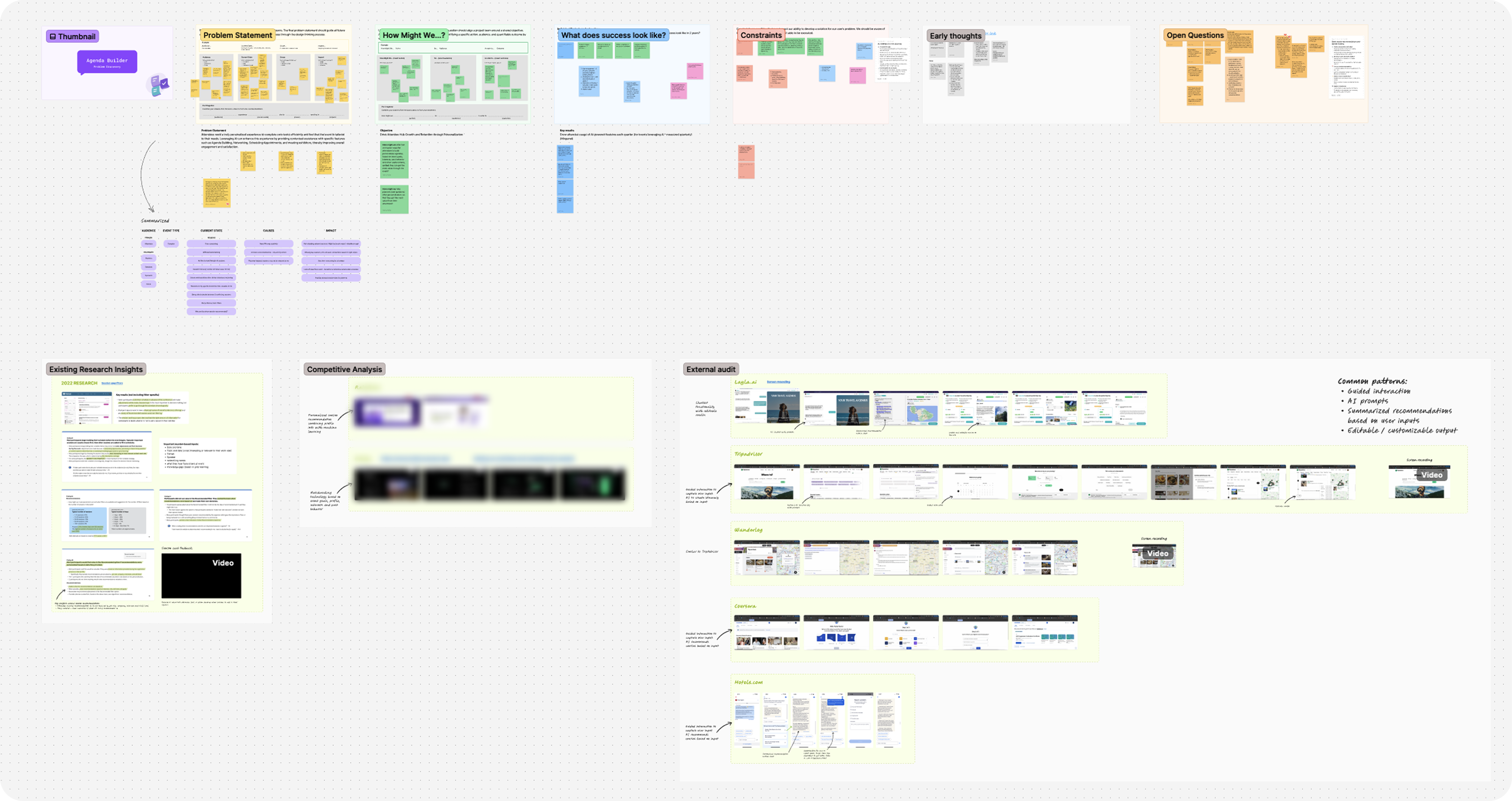
Research & Audit
Existing research · data analysis · internal audit for existing patterns
Problem Discovery
Define problem · constraints · users · assumptions · cross-functional workshop
Ideation & Scoping
JTBD journey map · ideation workshops · OST · scope decisions
Design & Iteration
Wireframes → hi-fi · multiple iterations · feasibility checks · stakeholder reviews
Usability Testing ×2
Round 1 → received feedback · improved designs · Round 2 → validated
Phase 01
The project began with a clear OKR: simplify agenda building for event attendees through personalization. Before running any workshops or drawing any wireframes, I invested time in building a deep, evidence-based understanding of the problem space. This meant going through all existing research insights related to agenda building, analyzing user behavior data in MixPanel and Sigma, and conducting a thorough internal audit of the current agenda-building experience across all products.
This phase was less visible but foundational. Without it, the workshops that followed would have been speculative. With it, I could walk into the room with validated pain points, concrete data, and a clear picture of what was already known, and what wasn't.
Phase 02
Armed with that research, I planned and facilitated a problem discovery workshop with product, research, and design partners. The goal wasn't to brainstorm solutions; it was to collectively agree on the problem. Together, we defined the problem statement, surfaced the constraints we'd be designing within, identified who the users were and what we already knew about them, listed the open questions we'd need to answer, and made our assumptions explicit so we could track and test them.
The output was alignment - a shared, documented problem statement that the whole cross-functional team could point back to throughout the project. This step made every subsequent decision faster and less contentious, because we had already agreed on what we were solving for.
Phase 03
With a clear problem statement in hand, I moved into ideation. Using existing Jobs-to-be-Done research data, I created an attendee journey map that deliberately extended well beyond the boundaries of Attendee Hub. The full journey I mapped included the pre-event registration experience within a separate platform where they could sign up for initial sessions, and then the in-event experience inside the Attendee Hub platform post-registration.
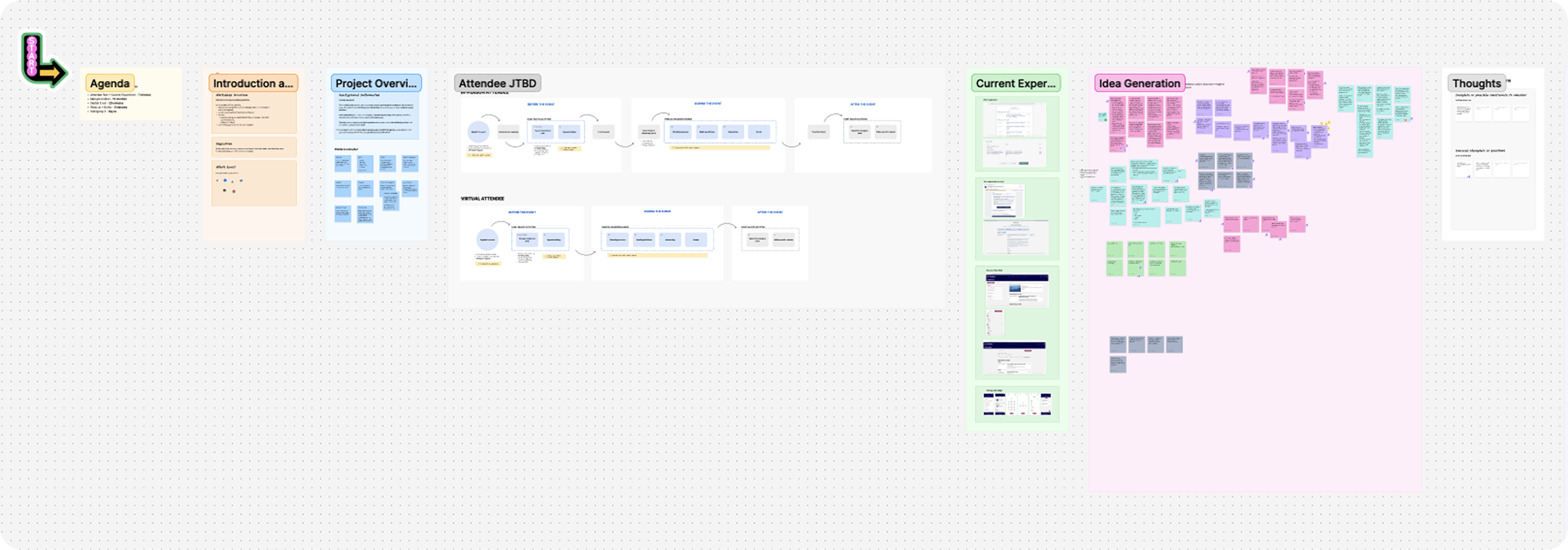
I facilitated a design ideation workshop with the design and research teams, using the journey map as a shared reference. Grounding participants in the attendee's full lifecycle, not just their in-app experience, led to a much richer set of ideas. The session generated concepts that spanned Attendee Hub and beyond, including suggestions for improving touchpoints in the registration flow. After the workshop, I wireframed the strongest concepts and presented them to design leadership and stakeholders, receiving positive and directional feedback.
But this created a new challenge - we had too many good ideas and no clear scope. To resolve this, I organized and facilitated an Opportunity Solution Tree (OST) workshop with my product partners and Design Manager. We stepped back to the OKR, mapped out the various opportunities around it, listed the solutions each opportunity could yield, and surfaced the assumptions behind each.
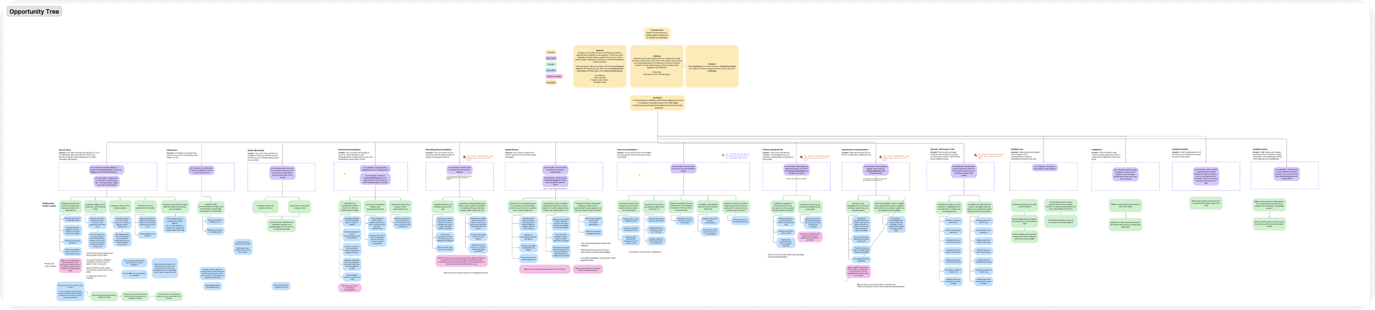
This exercise narrowed the project to its final scope - an AI-powered recommendation flow that personalizes session suggestions based on attendee interests, goals, and behavioral data. The OST workshop was arguably the most strategically important step of the project. It happened before a single high-fidelity screen was drawn, and it set the direction for everything that followed.
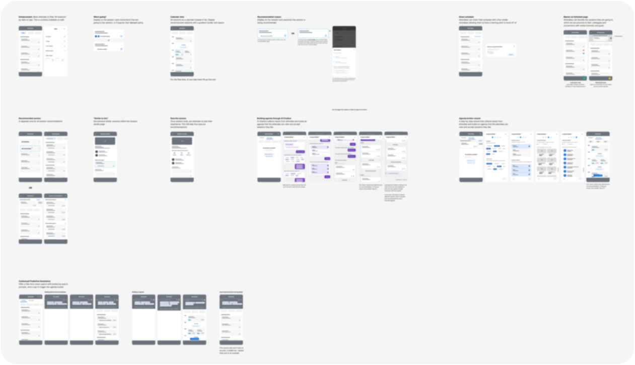
Phase 04
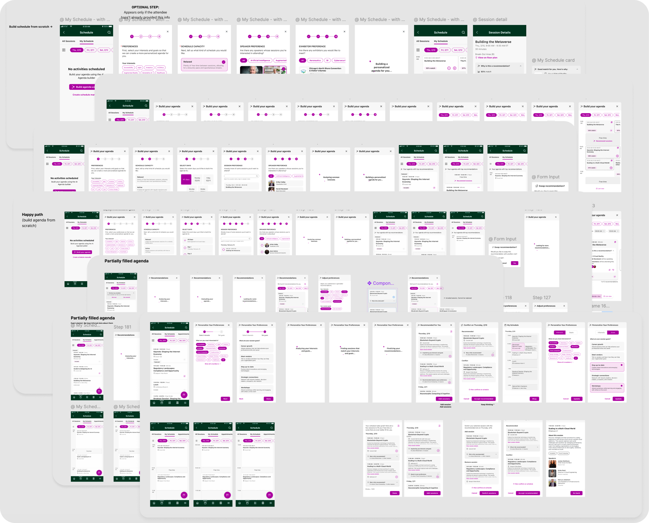
With clear direction, I began designing the solution. The designs went through multiple rounds of iteration; reviewing with stakeholders to check feasibility and for feedback, and refining until we felt confident enough to usability test the designs.
Phase 05
Working with our user researcher, we ran the first round of usability testing.

Missed entry point
The AI sparkle icon on the floating action button was too small and unrecognized. Users missed the feature entirely on first viewing.

Unclear content
The language in the goals selection step wasn't very clear resulting in users not selecting certain options.

Missed conflicts
Users expected an explicit warning when a recommended session conflicted with one already on their schedule.
After incorporating all changes, we ran a second round of usability testing. All participants described the updated flow as clear, intuitive, and easy to use.
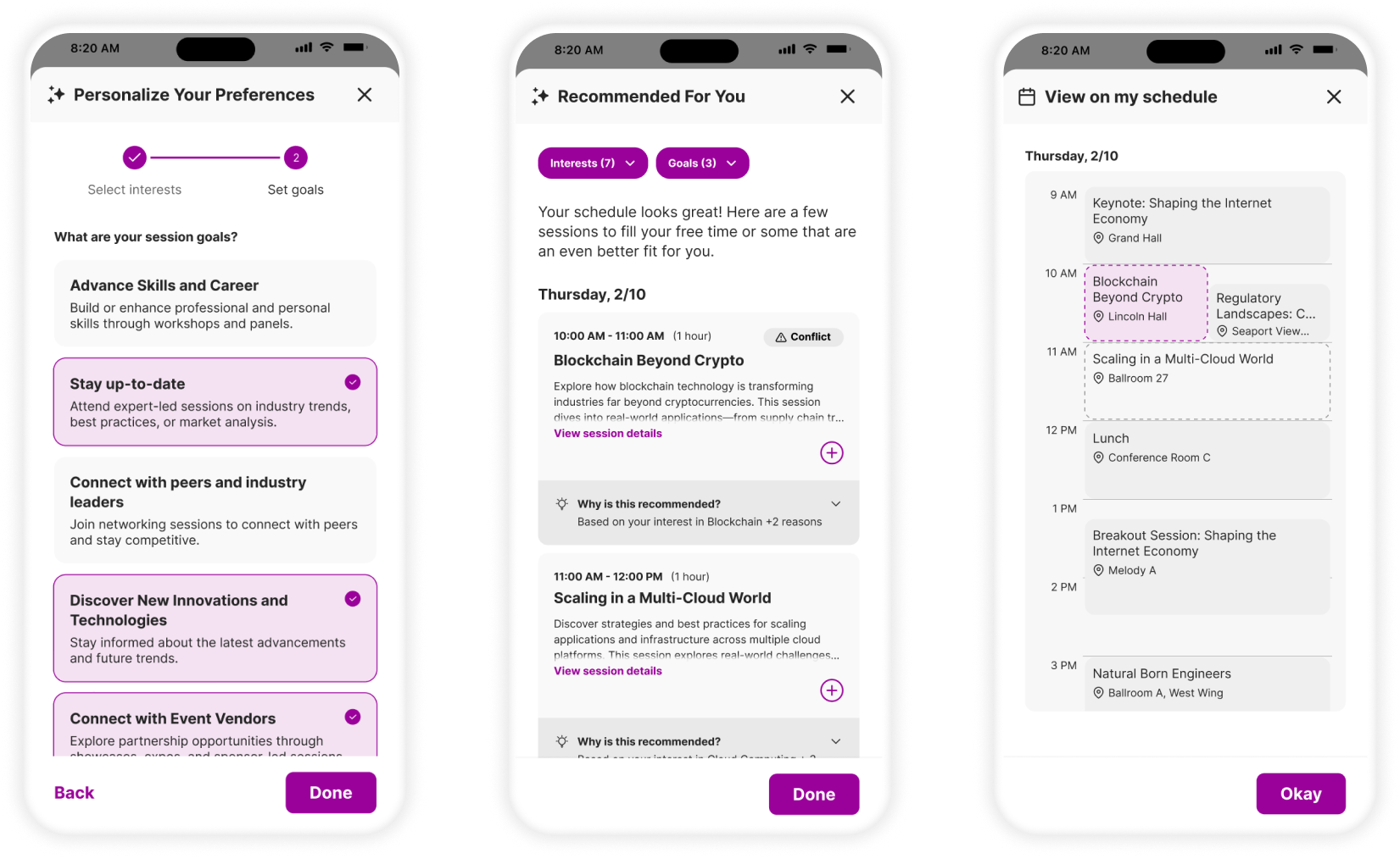
The design we landed on was a three-step workflow where each step builds on the last, from empty or partially built schedule to personalized, conflict-aware agenda.
Social Proof (Connections Attending)
Additionally, a hyperlinked connections count was added to the
recommendation card, bringing a genuine layer of social context into the decision.
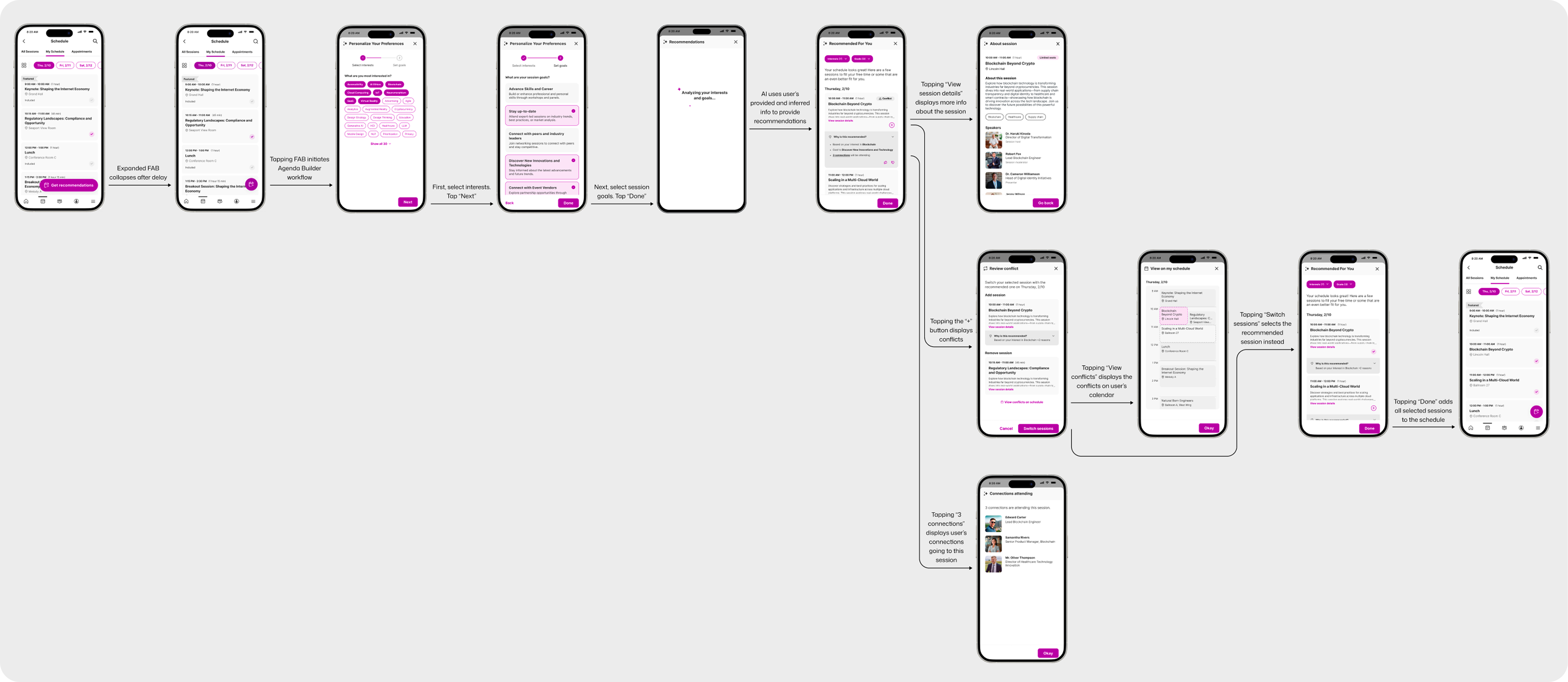
Measurable usability improvement
On incorporating user feedback, usability drastically improved in the final round of testing. All participants described the flow as clear, intuitive, and easy to use.
What I learned
The most valuable design work on this project happened before any screen was designed. Running the problem discovery workshop and then the OST scoping session meant the team was aligned, the scope was defensible, and the solution we built was solving the right problem.