Cvent
A high-impact project offering event planners typography customization to brand their event site and app. The project required a platform-wide typographic clean-up before customization options could be offered, making it as much a foundational infrastructure project as a feature build.
M$+
In deals directly unblocked by this feature
2
Platforms delivered: web and mobile app, each phased separately
★
Long-standing customer request
My role
End-to-end ownership, from research and audit to design, dev handoff and beyond
Tools
Figma · FE tools · MixPanel · Customer Request Data
Duration
2 years
~1 yr Web, ~1 yr App
Team
PD II → Senior PD (me) · 1 Design Architect · Content Designer · Localization Specialist · 3 PMs · FE & BE Engineers
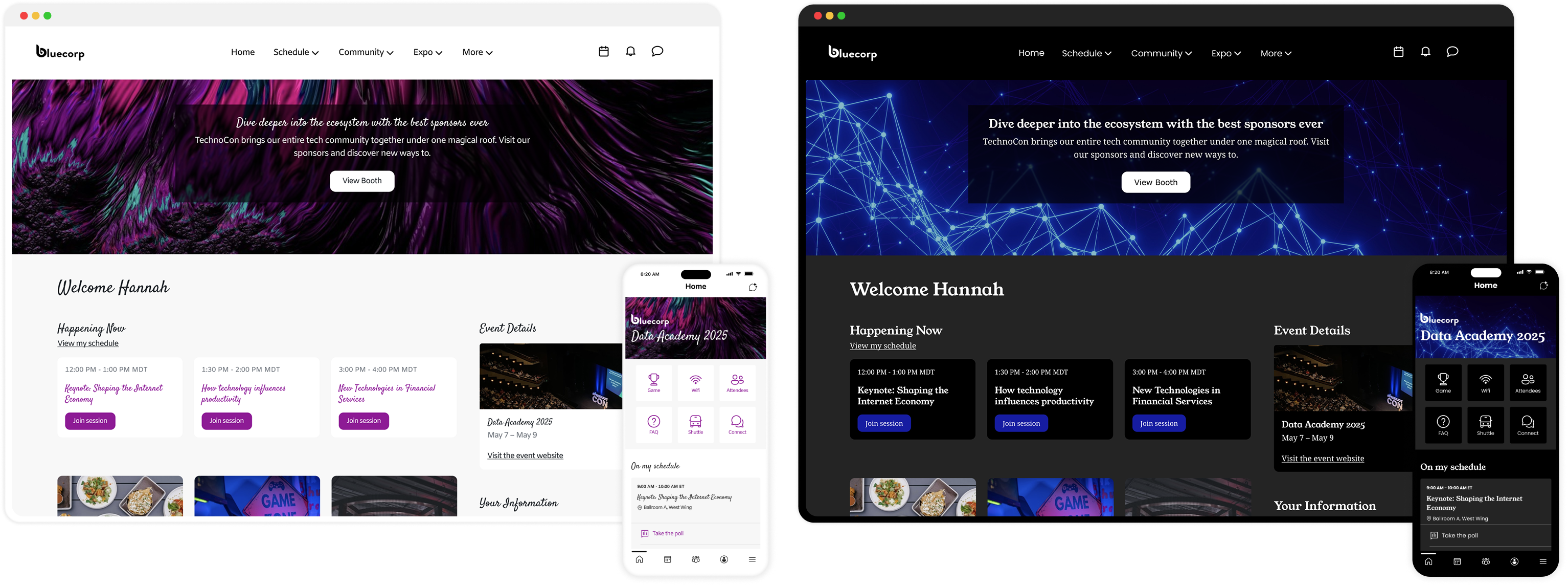
Cvent's Attendee Hub is an all-in-one digital event platform powering virtual, hybrid, and in-person experiences. It centralizes session browsing and scheduling, networking and engagement, content delivery as well as gamification.
Prior to this project, every event running on Attendee Hub looked typographically identical - a single, fixed, Cvent-decided font applied uniformly across all customer events, regardless of what the event planner's brand looked like.
A visible brand gap
For enterprise clients with strict brand guidelines and high-production events, the platform didn't feel like theirs. The platform had no mechanism for brand expression at the typographic level.
A well-established business case
Typography customization was a long-standing customer request logged as a blocker on multiple enterprise deals. Delivering it meant unlocking revenue, improving competitiveness, and closing a gap that competitors had already addressed.
Planners feel that the current Attendee Hub experience does not properly communicate their brand. How might we offer intuitive ways for planners to apply their branding elements to Attendee Hub, while ensuring consistency in experience across the different products we offer them?
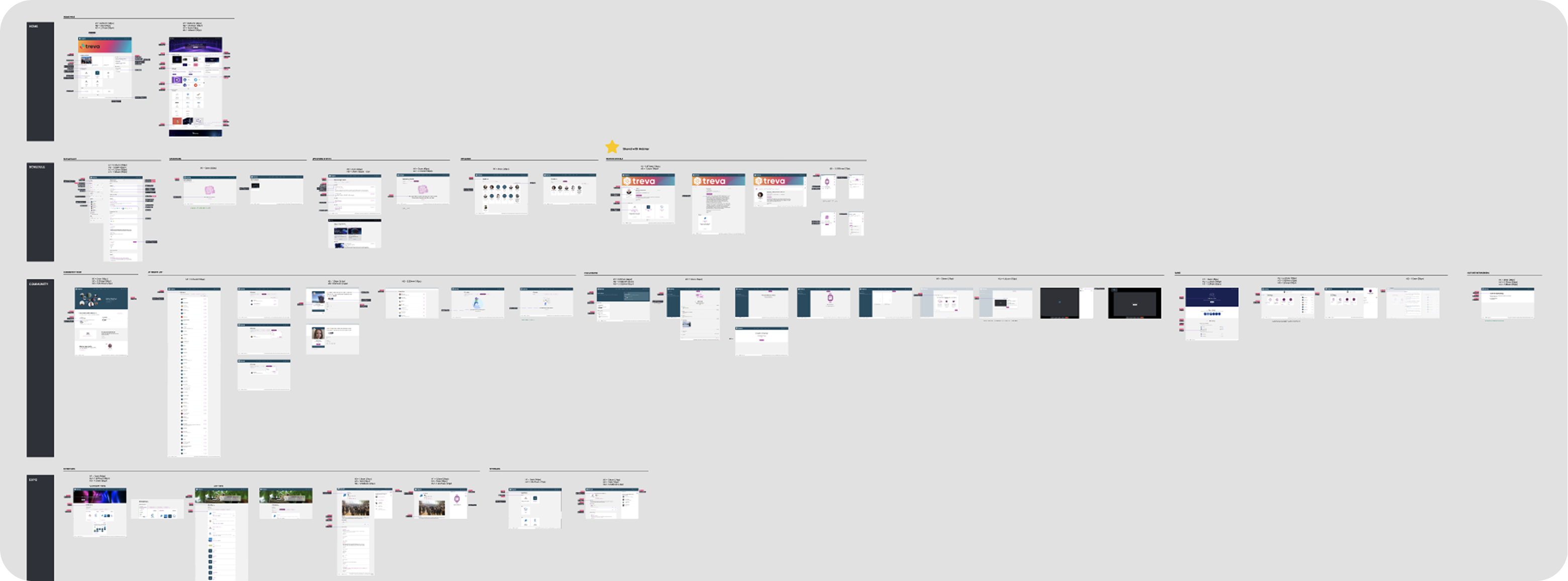
This project had an unusual shape: the majority of foundational work happened before any customization UI was designed. The typography system on both platforms needed to be audited, corrected, and standardized first, otherwise, offering planners font control over an inconsistent system would have produced unpredictable, often broken results.
Research & Audit
Customer request data · existing research · web and app internal audit
Platform Clean-up
Accessibility fixes · semantic corrections · visual hierarchy improvements · new app font tokens
Font Logic & Mapping
Defining heading vs. body rules · validation across brand themes · Design system token alignment
Solution Design
Font library curation · planner interface · custom font support · accessibility guidance
Governance & Handoff
Engineering specs · typography guidelines · cross-team documentation
Phase 01
I started by going through customer request data and existing research to understand exactly what planners were asking for and why. The consistent theme was brand identity. Planners wanted their events to feel like their brand, not like a generic software platform. I also studied our web and app platforms to understand how typography was being applied within the system.
This research confirmed that not only did we need to offer a missing feature, we also need to improve the typographic foundation of both the platforms.
Phase 02
This was the most critical, and least visible, phase of the project. Without it, offering planners font customization on top of an inconsistent typography system would have created unpredictable visual results; sometimes breaking layouts, sometimes producing inaccessible text, sometimes rendering incorrectly on different screen sizes.
I conducted a granular review of every screen in Attendee Hub's web experience. The audit surfaced a significant number of typographic inconsistencies; most critically, elements that were semantically tagged incorrectly. Headers were marked up as paragraph text and vice versa. This had two compounding consequences: it undermined the visual hierarchy of the pages, and it created real accessibility issues for screen reader users.
I identified and documented every required fix - CSS overrides, semantic element re-tagging, and spacing adjustments - and worked closely with engineering to implement them. I also mapped out precise vertical spacing adjustments across pages to establish clearer visual hierarchy independent of font selection, so the layout would hold up regardless of which font a planner chose.
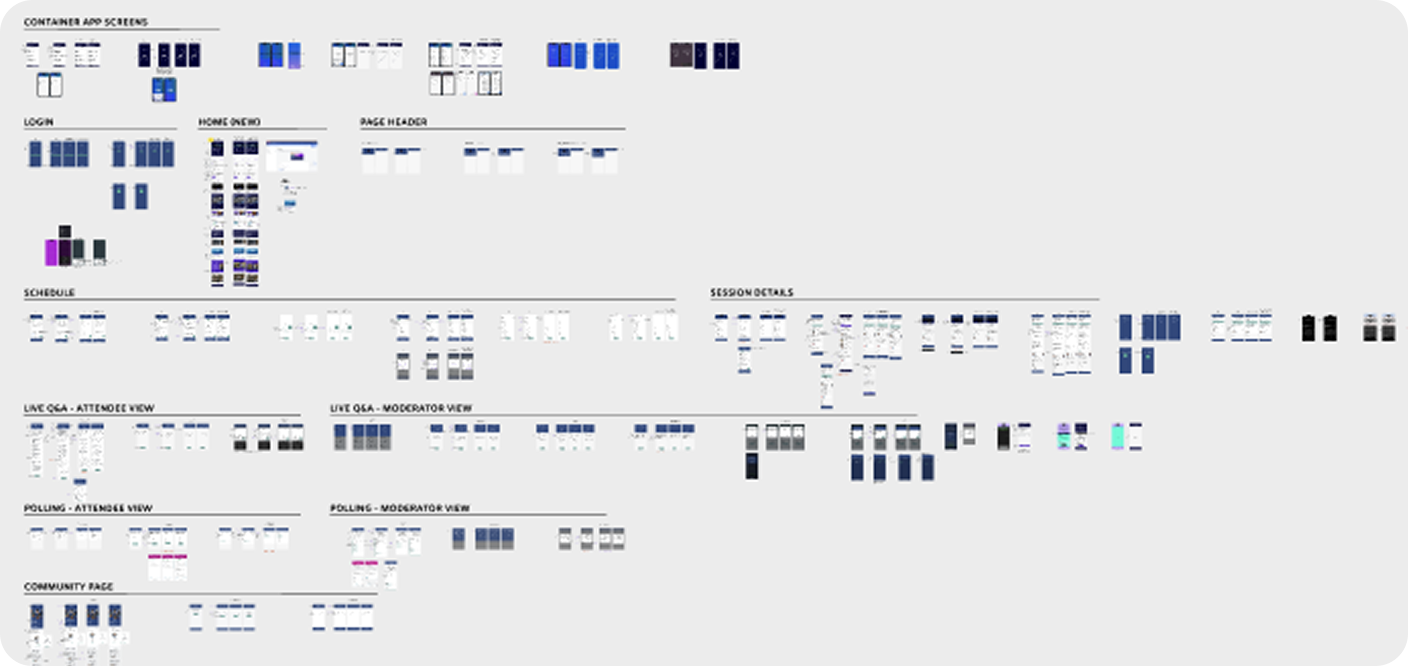
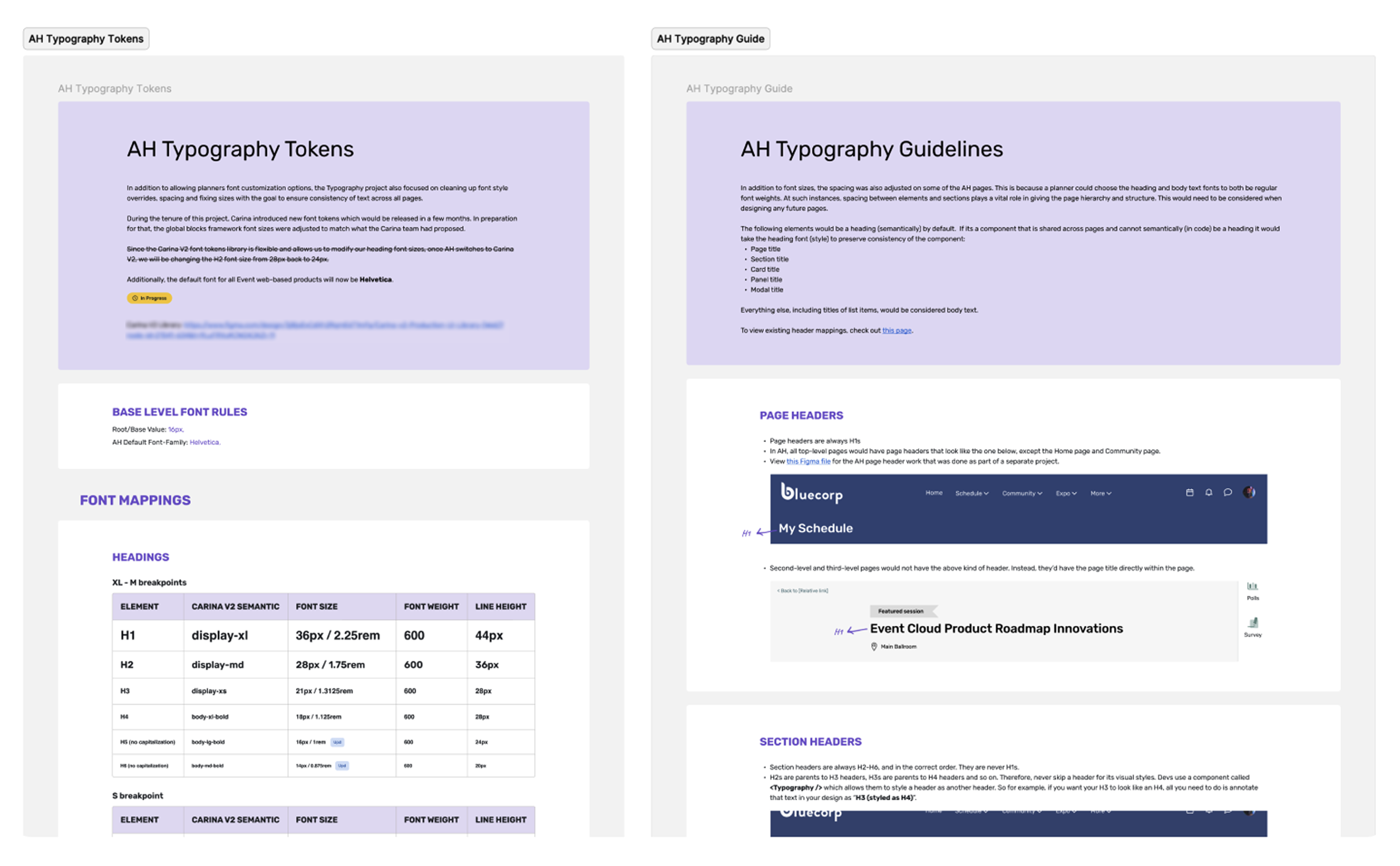
I ran a similar audit of the mobile app, identifying all text element inconsistencies across app screens. What became clear during this audit was that the app's existing font size system was dated and needed a fundamental overhaul before font customization could be applied reliably.
Based on the audit findings, I worked with our Design Architect to define and recommend a new set of font tokens for the app, covering both header and body text sizes, built on correct sizing ratios, updated line heights, and proper typographic hierarchy. This was a foundational product-specific design systems contribution that improved the app's typography baseline regardless of whether a planner ever touched a font setting.
Phase 03
With both platforms cleaned up, I worked closely with the Design Architect, our Design team and our Product partners to define the rules for how planner-selected fonts would be applied across the entire experience. This wasn't just a design decision; it was a product decision with real implications for accessibility, readability, and engineering complexity.
We defined clear, product-wide rules for which text elements would inherit the Heading Font and which would inherit the Body Text Font. The rules we defined were then documented and communicated across the design team to ensure consistent application in future work.
To pressure-test the mapping, I pulled common font pairings from Site Designer (a sister product) and applied them to Attendee Hub screens. I then simulated popular brand themes to validate that the system held up visually across varied real-world scenarios. This validation step was what gave us confidence that the two-font rule was the right constraint, not an arbitrary one.
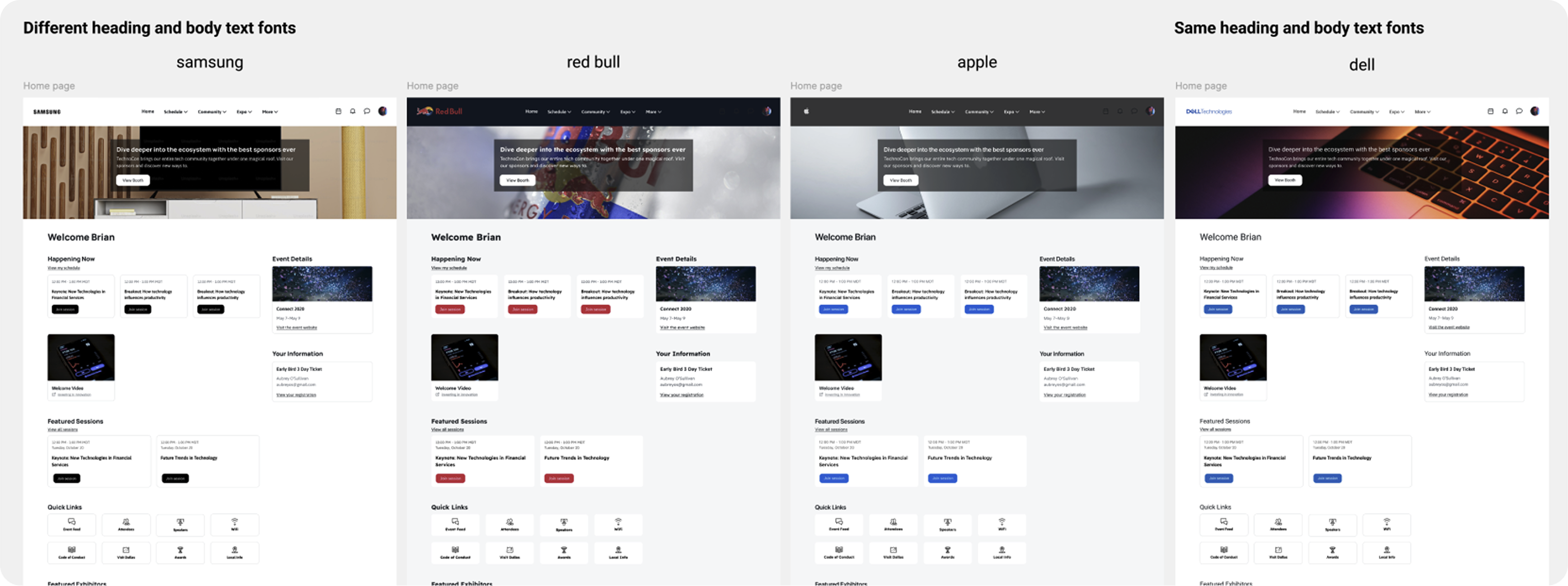
A core design decision was limiting customization to exactly two fonts: one for all headings, one for all body text. This was deliberate, and driven by three factors:
Readability & hierarchy
A two-font limit guides planners toward established typographic best practices. Headers need to be scannable; body text needs to be sustained and legible over longer reads. Allowing a different font per element would risk planners applying decorative or low-legibility fonts across large swaths of content.
Brand alignment
Most corporate brand guidelines define a primary and secondary font. The two-font system maps directly to how brands are already structured; a distinctive brand font for headers paired with a clean, readable font for body content. Sweet spot between brand expression and consistent attendee experience.
Technical simplicity
Limiting to two tokens significantly simplified engineering implementation on both platforms. The team could focus on reliably swapping font files for only two fonts across the entire platform, rather than managing per-element font controls, which would have multiplied complexity and the potential for rendering errors considerably.
The final step of this phase was ensuring the new font rules were aligned with Carina, Cvent's design system, and that heading font tokens were standardized for web. For the app, the new token system defined in the audit phase was formalized and handed off to engineering with complete specifications.
Phase 04
With the foundation in place, I designed the planner-facing customization interface. The goal was to give planners meaningful brand control without exposing them to the underlying complexity of the system - the font mapping, the token logic, the platform differences - while still giving them enough transparency to make informed choices.
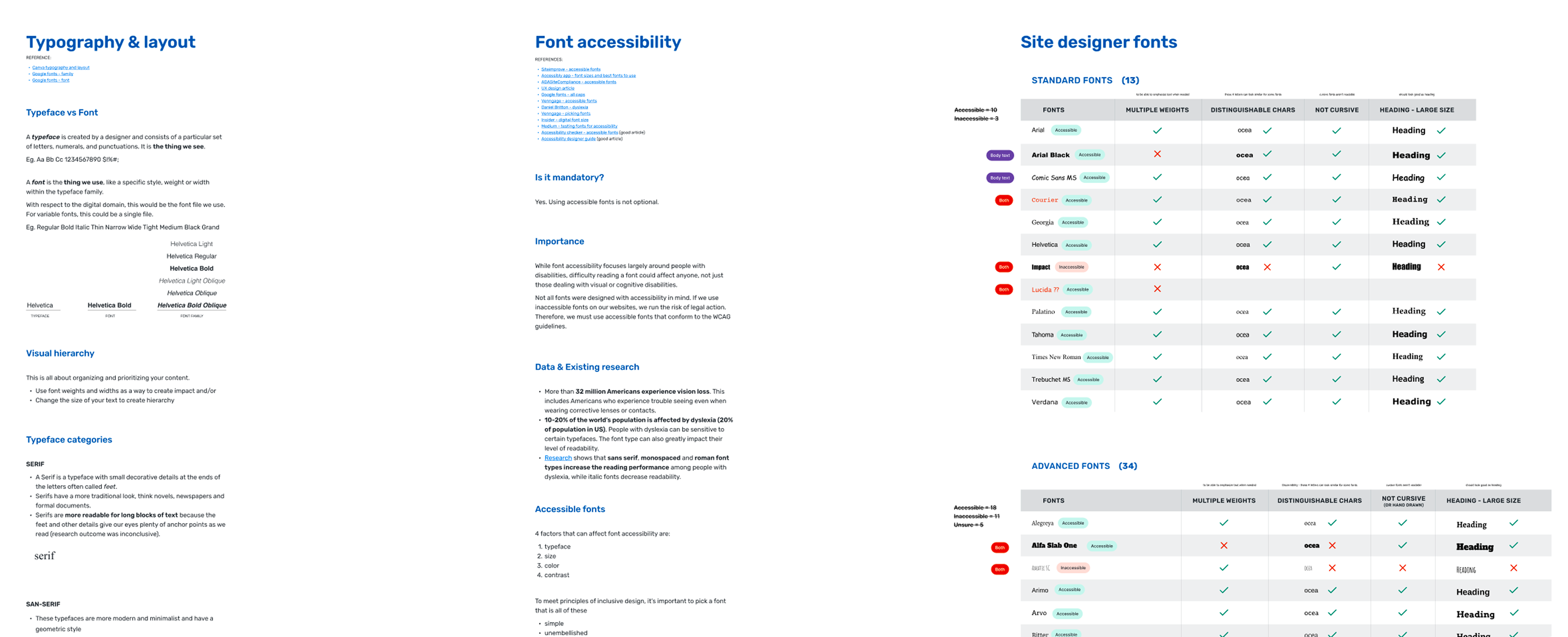
I worked with our Design Architect to audit the existing font list, retire outdated or poorly performing options, and integrate a curated selection of Google Fonts, standardizing the library across all platform products in the process. The curation wasn't just aesthetic: I researched each font for accessibility characteristics (legibility at small sizes, distinguishable characters, readability for users with dyslexia) and flagged fonts that posed potential accessibility risks.
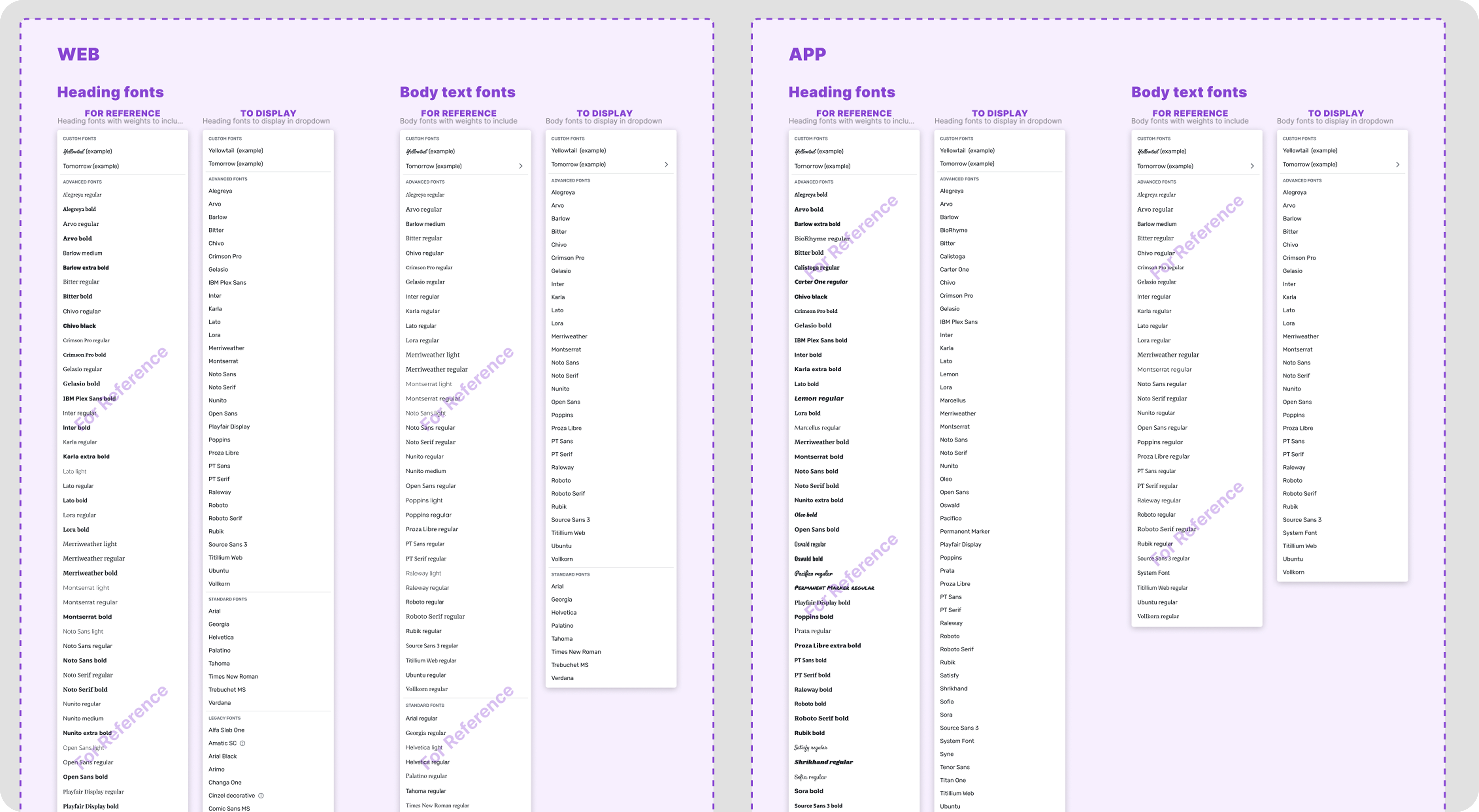
The interface allows planners to separately select heading and body fonts for both web and mobile app. Three key design decisions shaped the interface:
Live preview: Font choices are reflected immediately on a sample Attendee Hub screen, so planners can see the impact of their selection in real context before saving. This was a high-priority request in prior planner research.
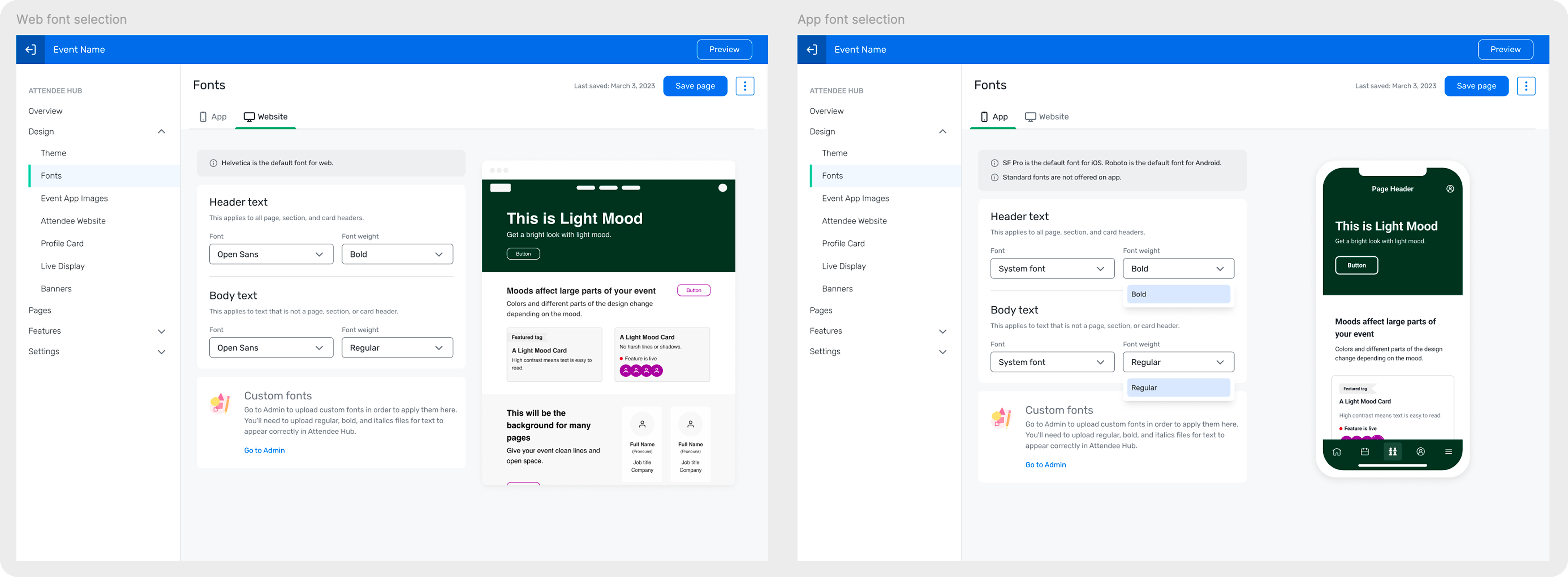
Custom font support: Planners can upload proprietary brand fonts via the Admin system, which then become available as options within the font selector. This addressed the needs of enterprise clients with strict brand guidelines who couldn't use any font from our font library.
Accessibility guidance: For fonts identified as having potential readability issues, a non-blocking warning is shown in the interface informing planners of the concern while leaving the final decision with them. This approach respects planner autonomy while guiding toward best practice.
Phase 05
A feature like this only stays consistent if the rules behind it are shared. Once the system was designed and validated, I documented and communicated typography guidelines to all Attendee Hub product designers; covering semantic heading usage, when to use spacing vs. font weight for hierarchy, and how to work within the two-font token system in future design work.
I also worked closely with engineering throughout implementation; reviewing builds on both platforms, catching rendering edge cases, participating in bug bashes, and ensuring the custom font logic behaved correctly across varied planner configurations.
Business impact
The feature satisfied a long-standing customer requirement and was a direct factor in closing multiple million-dollar deals.
Brand transformation
Event planners can now fully personalize Attendee Hub's typography for their events, transforming the platform from a generic interface into a true extension of their event brand.
Platform health
The foundational clean-up improved the overall accessibility and maintainability of the Attendee Hub codebase significantly. Many of the semantic and token fixes benefited the platform beyond the scope of this feature.
What I learned
The most time-intensive part of this project was the audit and clean-up phase. The underlying typographic foundation of the system needed to be reliable and consistent in order to offer a customization feature built on it. Taking the time to fix the system before exposing it to user control was the right call, and it produced improvements that outlasted the feature itself.