Cvent
A low-adoption networking feature revitalized by a single, well-reasoned design pivot, shifting the UI from a group chat metaphor to a social feed metaphor, resulting in higher attendee engagement and increased planner confidence in the feature.
3
Months end-to-end
0
Backend changes. All impact through front-end redesign alone
↑
Uptick in planner enablement of the feature post-launch
↑
Rise in both active posts and passive reactions from attendees
My role
Led discovery, defined scope, and redesigned UI of project having technical and time limitations
Tools
Figma · FigJam · MixPanel · Customer Support data
Duration
3 months
Team
Senior PD (me) · Content Designer · Localization specialist · Product Owner · FE Engineers
Cvent's Attendee Hub is an all-in-one digital event platform powering virtual, hybrid, and in-person experiences. It centralizes session browsing and scheduling, networking and engagement, content delivery as well as gamification.
Attendee Hub includes a Chat Discussions feature designed to facilitate attendee networking during events. Networking is often cited as one of the top reasons people attend events, so a feature that supports it well has real product value. However, the Chat Discussions feature saw low planner adoption and attendee engagement.
Attendees weren't engaging
MixPanel data and Customer Support cases told a consistent story: attendees weren't sure how to use the feature. They hesitated to post, unsure if their message would go to everyone or just a few people.
Planners weren't enabling it
Seeing low engagement, planners were hesitant to enable the feature at their events. The result was a self-reinforcing cycle of low adoption. The feature existed, but it wasn't generating value for either side of the platform.
The constraint was equally important: there was no budget or runway for a backend overhaul. Whatever the solution was, it had to be achieved through front-end changes alone, delivered in three months.
How might we update our existing feature so that it meets attendees' needs for a social wall-style networking experience, thereby increasing utilization and boosting event planner confidence in our solution?
The project moved through five phases, each tightly scoped to the three-month window and the no-backend-changes constraint.
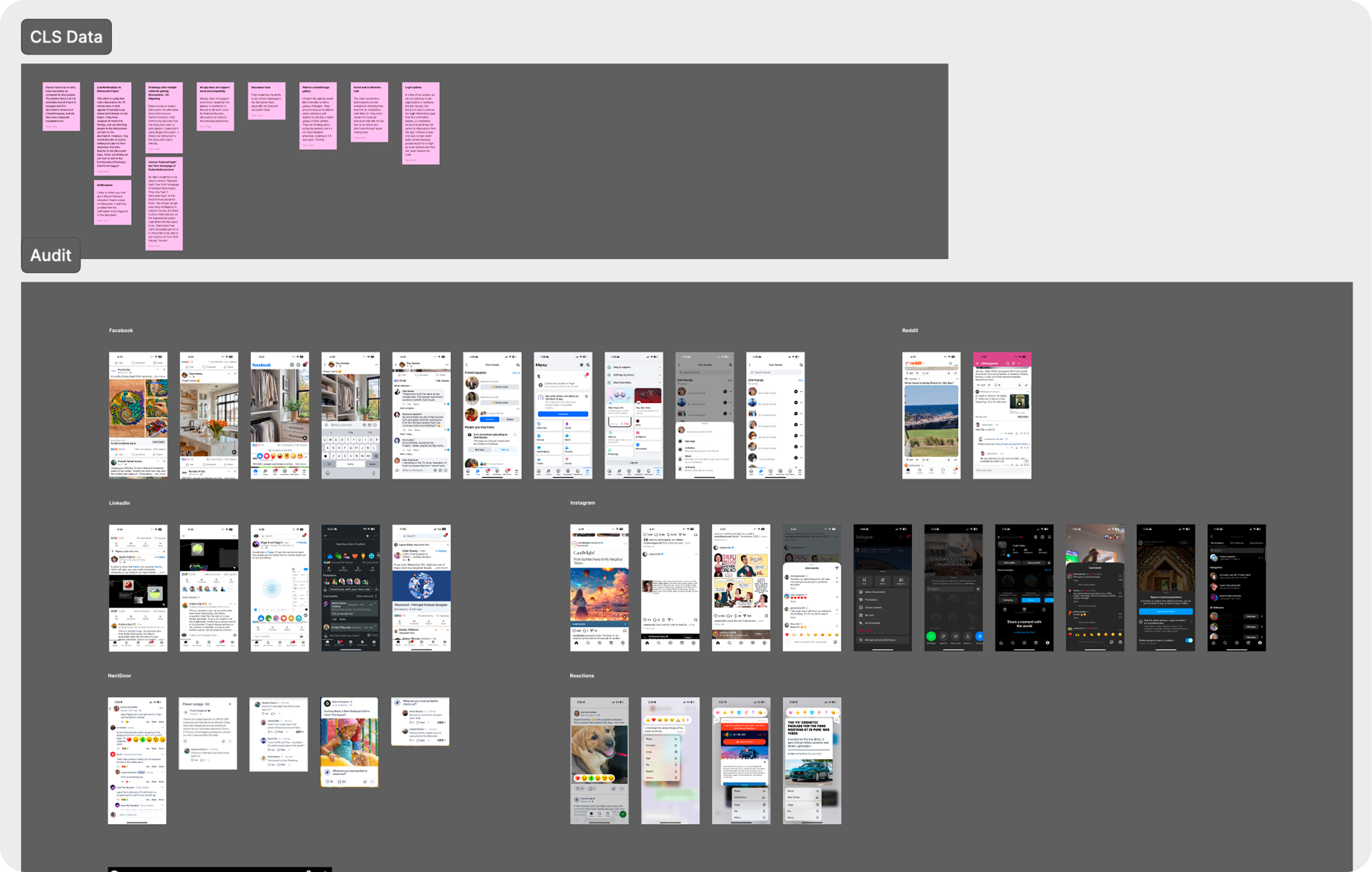
Data & Audit
MixPanel analysis · Customer Support review · internal feature audit
Discovery & Competitive Audit
Understanding user mental models · familiar social patterns · interaction conventions
Scoping
Defining what changes and what stays the same · aligning with engineering
Design & Feasibility
Front-end redesign within third-party library constraints · engineering review
Delivery
Shipped with mostly only front-end changes · post-launch data validated
Phase 01
The first step was understanding why adoption was low. I partnered with our product partner to analyze MixPanel behavioral data and review Customer Support cases to look for patterns. We noticed a mismatch between what the feature was and what users expected it to be.
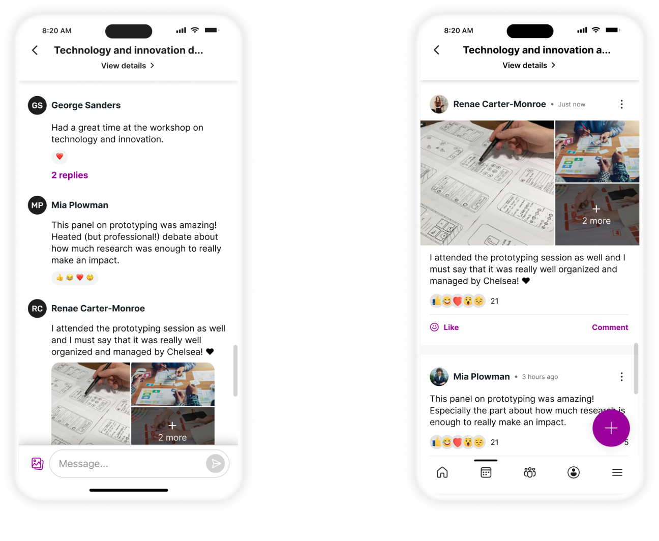
The existing interface used a traditional group chat layout; left-aligned message bubbles, a linear thread, a text input at the bottom; which was more of a visual language for private, one-to-one or small-group messaging. But Chat Discussions was meant to be a public, event-wide social space; the digital equivalent of a conference hallway or a community board.
The problem wasn't the feature's functionality. It was the presentation.
Phase 02
With the core issue identified, I conducted a competitive audit of major social platforms like LinkedIn, Facebook, and Instagram, to study the interaction patterns our users were already fluent in. The goal wasn't to copy these platforms, but to understand what visual and interaction cues they use to signal "public post" rather than "private message."
The patterns were consistent across all three: full-width content cards, reactions surfaced at the card level, comment counts visible without tapping, chronological or ranked feed ordering, and avatar photos prominently displayed. These were established conventions that users had internalized through years of daily use.
Phase 03
Working with the Product Owner and engineering partners, we defined the scope with a deliberately narrow frame; one that matched the three-month window and the no-backend-changes constraint.
Stays the same
What changes
Only the visual experience changes, like the layout, the interaction patterns, and the surface-level UI.
Why this scope
Phase 04
Working within the constraints of the third-party library the feature was built on, I designed a front-end experience that shifted the feature's visual language entirely.
The most impactful single change was moving from left-aligned message bubbles to full-width content cards. This one shift reframed the feature completely. Full-width cards are the visual language of public posts, not private messages. Users could immediately read the layout as a feed, not a chat.
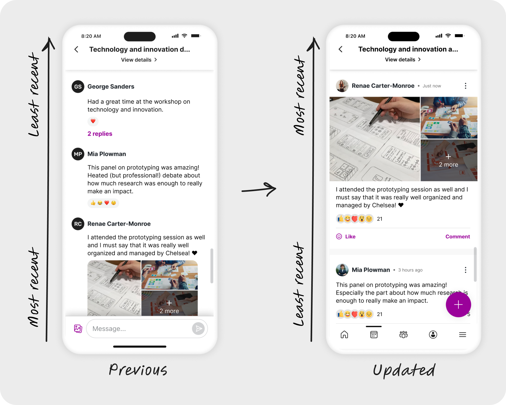
Reaction and reply options were moved from a long-press-only interaction to visible, tappable controls at the card surface level. This removed the barrier for users belonging to the higher age range and passive users. Attendees who wanted to engage but didn't want to write a full post could now react or comment with one tap, without having to discover a hidden interaction.
Every change was evaluated for both user impact and engineering feasibility before it was committed to. Together, they made the feature feel like a place people already knew how to use.
Post order
Reversed to show most recent posts at top, matching social feed conventions users already know.
Avatars
Updated to display profile photos rather than initials-only placeholders; adding a human, social dimension to each post.
Post creation
Simplified and made more intuitive, reducing friction for first-time posters.
Time elapsed
Displayed clearly on each post, orienting users in the feed and signaling recency at a glance.
Reactions
Updated to a more modern set with redesigned interactions easier to discover and use.
Commenting
Simplified with a cleaner reply flow, lowering the barrier from reading a post to responding to it.
Planner adoption
Post-launch, there was a measurable uptick in planners enabling Discussions at their events.
Attendee engagement
Data showed a rise in both active posts and passive reactions post-launch.
Delivered on time
The redesign shipped within the three-month window, within constraints and with no backend changes.
What I learned
Layout is language. Simply changing the container of the content and simplifying some of the interaction patterns, completely altered how users perceived and used the feature. It was a reminder that the most effective design solution isn't always a new feature. Sometimes it's reframing an existing one.